Typography is one of the strongest identifiers of your brand’s identity. Much like the icon element of a logo, the type choice will immediately visually communicate the tone and style of your brand identity. In this post we identify what characteristics and style each typeface conveys, when to use them (including accessibility considerations), and examples of each in use.
Typeface Categories
The four main categories of typefaces:
Serif
Slab Serif
Sans Serif
Script
Handwritten Script
Display
Serif
A serif typeface is one that has little legs on the characters. They are the oldest style of typeface created.
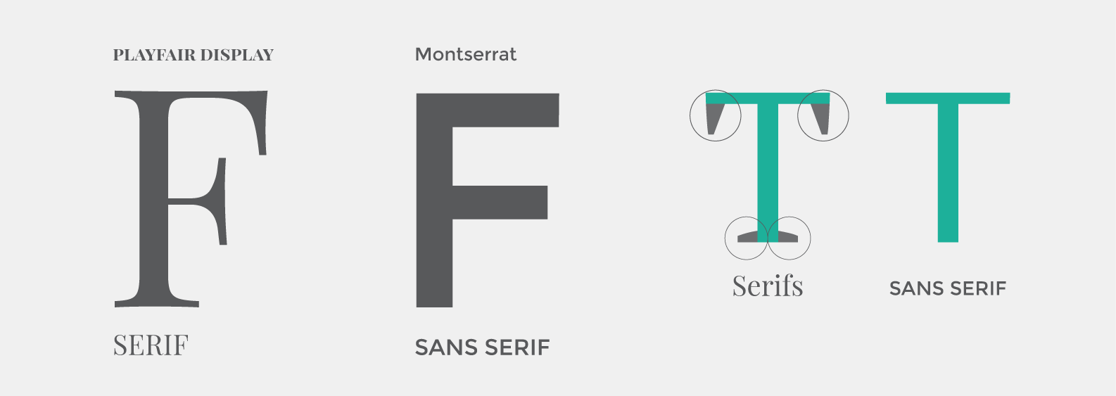
Style characteristics:
- Traditional
- Professional
- Luxurious

Slab Serif
A sub-family of serif fonts is the slab serif. The legs are blockish.
Style characteristics:
- Contemporary
- Architectural

Sans Serif
The most popular typeface is sans serif. It is clean, very readable and has a timeless modern style.
Style characteristics:
- Minimal
- Modern
- Readable


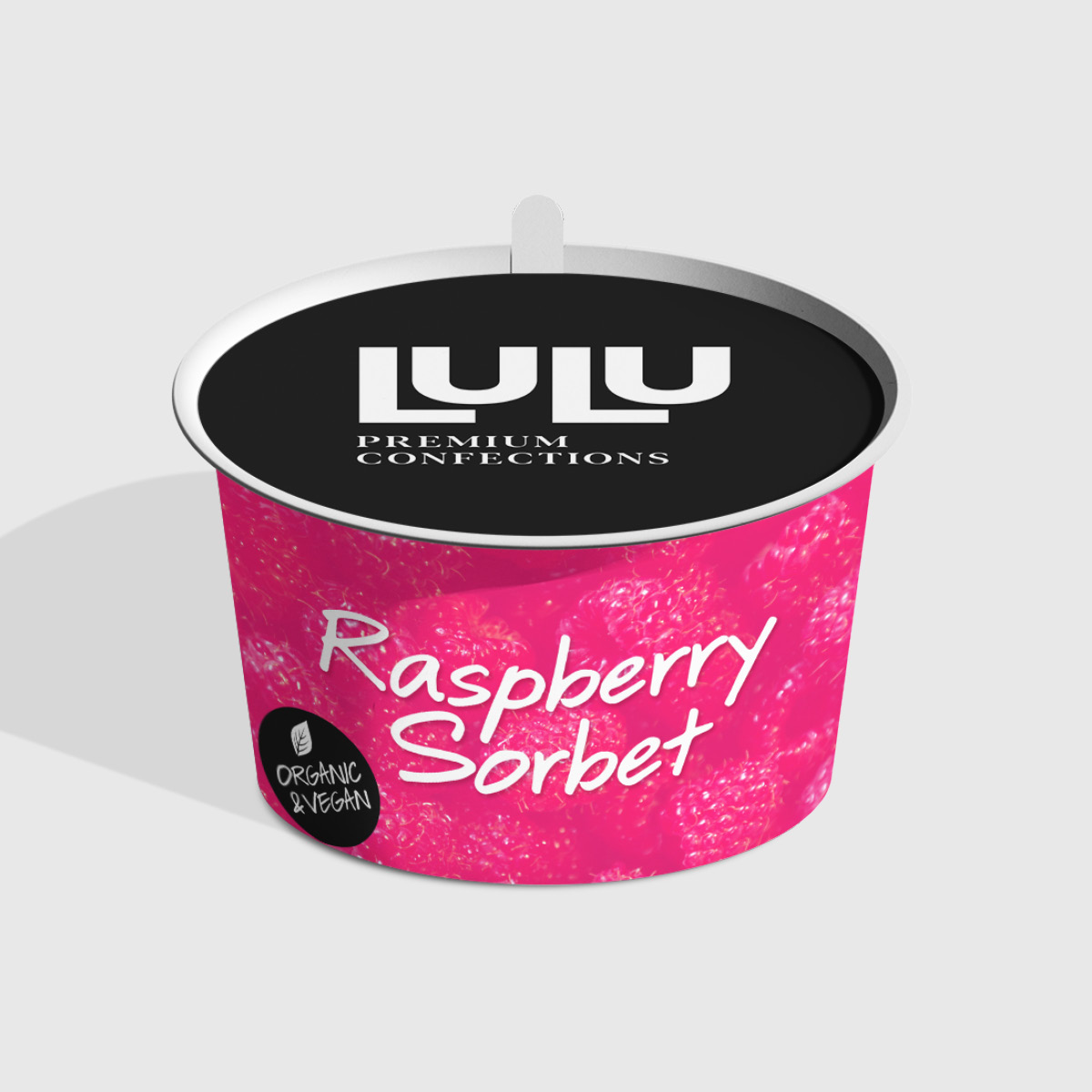
Script
Script fonts communicate elegance but readability can be a concern with script fonts so shouldn’t be used in a logo design (generally).
Style characteristics:
- Elegant
- Luxury
- Classic

Handwritten Script
A sub-family is the handwritten script.
Style characteristics:
- Casual
- Personal
- Authentic
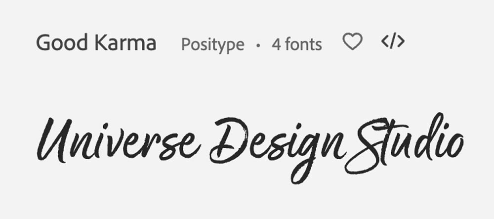
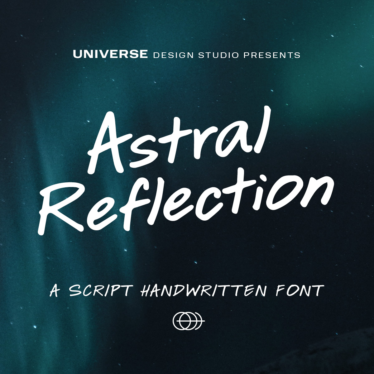
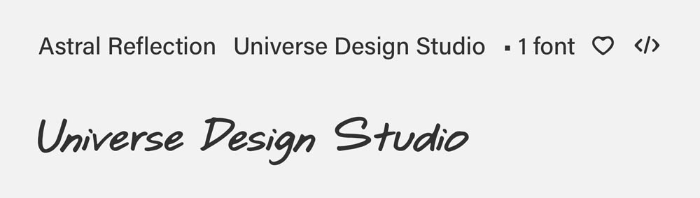
Universe created our own handwritten script font (from Elaine’s handwriting) called Astral Reflection which can be purchased on Creative Market.
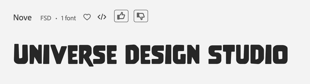
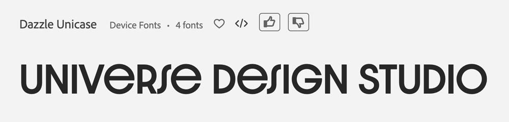
Display
Display fonts are everything that doesn’t fall into the above categories. They are often more decorative and have distinct personalities. They wouldn’t be used in body copy, only for a logo or a heading.
Style characteristics:
- Creative
- Futuristic
- Modern
- Geometric


Typography choices and accessibility best practices
The Web Content Accessibility Guidelines (WCAG) don’t define specific accessible fonts, however the principle for perceivable content states that “information and user interface components must be presentable to users in ways they can perceive”. So it is up to a designer’s discretion which fonts are the most appropriate in any given purpose.
Generally, we always want maximum readability and contrast with any logo, graphic or website design. And on websites, the fonts must be presented in live text that is easily scalable by the user (both by using browser functions and with website accessibility tools). Letterspacing and character styling (bold, italics, underline) should all be carefully used with study of current best practices and how they relate to viewers with vision challenges.
Dyslexia as an example
It is estimated that 15% to 20% of the population has Dyslexia
There used to be a belief that serif fonts such as Times New Roman were the most readable due to the serifs and the way the characters flowed into each other however new research has debunked that idea and currently we would say that sans serif fonts with a minimum size of 12pts are the most readable.
Highlights from a study of typography and dyslexia include:
- Font types have a significant impact on readability of people with dyslexia
- Good fonts for people with dyslexia are Helvetica, Courier, Arial, Verdana and Computer Modern Unicode, taking into consideration reading performance and subjective preferences.
- Sans serif, roman and monospaced font types increased the reading performance of our participants, while italic fonts did the opposite.
Related work
Nothing found.