When people think about colour we each have personal associations that are based on preference and cultural connotations. Your brand design should absolutely reflect your own taste and style but also connect with your audience in a strategic way. Colour is the most powerful design element that we can use to convey a feeling about your brand, research suggests people make a subconscious judgment about a product within 90 seconds, and 62% to 90% of that assessment is based on colour alone. Let’s look at the latest research on colour and learn about the science and psychology of colours relating to brand design.
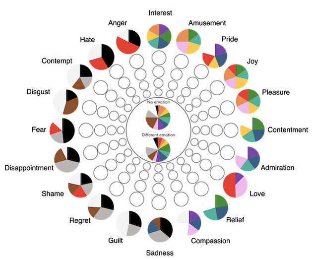
Colours & Their Emotional Connection
A colour psychology study by Psychology Today looked at Why Links Between Colours and Emotions Seem to Be Universal
Highlights from the study:
- Most colours were associated with positive emotions
- Darker colours — brown, grey, and black — were associated with negative emotions
- Red was the most controversial colour. For some, it was a very positive colour — of passion, love, and desire. For others, it was a negative colour — of danger, anger, and hate.
Colour & Gender Connotations in 2022: Does it Matter?
Where did “pink for girls and blue for boys” come from?
From How Pink And Blue Became Gender-Specific: Around the turn of the century, both sexes wore easily bleached white dresses up to age 6, meaning that gender neutral clothing was the norm. Then things slowly shifted. The baby boomers in the 1940s were the first to be dressed in the sex-specific clothing that Americans are familiar with today. Boys and girls were dressed like miniature men and women instead of uniformly in children’s dresses.
These connotations are now ingrained in our cultural consciousness so something to consider when selecting colours for your brand design.

An interesting study looks at this specifically — English colour terms carry gender and valence biases: A corpus study using word embeddings:
- Empirical studies, focused on colour preferences and colour connotations, have demonstrated that pink is considered to be a feminine colour and blue a masculine colour. Pink further represents groups of low social power and low social status. Accordingly, adult women might shun pink to avoid being associated with these representations.
- Red, on the contrary, represents being in power, dominant, and of high social status. These representations potentially explain why adult women like red and why red carries both positive and negative connotations. When it comes to valence, pink and blue both have been associated with mainly positive emotions, although blue has been also associated with sadness.
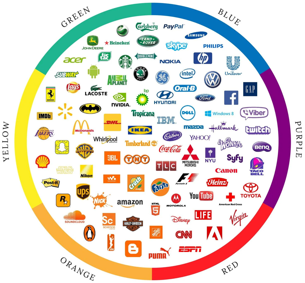
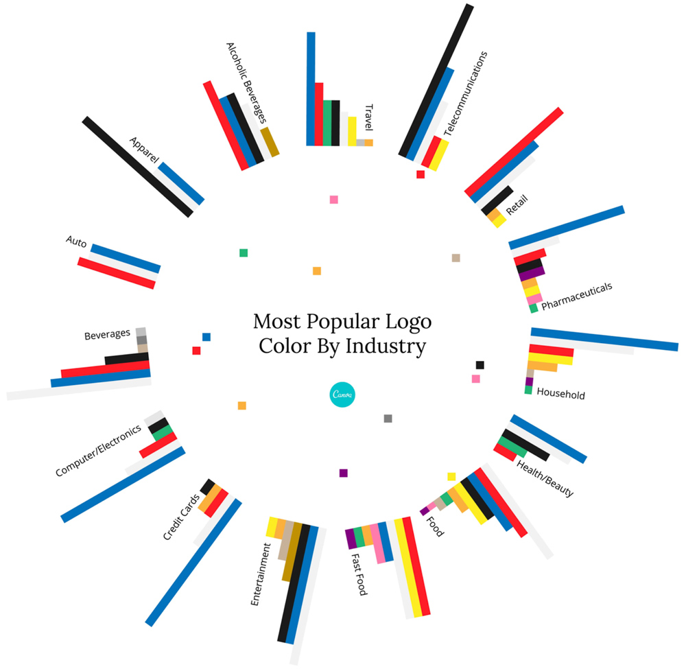
Brand Colours & Their Popularity by Industry
Is it important to use colours that are inline with your industry and what is typically expected? Generally.. probably. There are reasons certain colours are psychologically universally associated with specific brands, products, and industries.
Research on colour differentiation in the marketplace highlights how certain industries frequently use particular colours. Highlights:
- blue is used in over 75% of credit card brand logos, and 20% of fast food brand logos.
- Red, meanwhile, is found in 0% of apparel logos — but over 60% of retail brands.
Related work
Nothing found.