In this post we discuss colour considerations, trends and how the colours that we define for your brand’s palette will define your brand visually and create immediate brand recognition. In a recent blog post we looked at why brands in certain industries often have similar colours, the psychology of colour, research, and how colour relates to emotions.
Colour considerations and connotations
Your brand’s colour palette will immediately reflect a tone (ie: energetic, subdued, professional). It can also express visually:
- a demographic (ie: primary colours: youthful, pastels: babies)
- an era or time (ie: contemporary, dated, 70s, 90s)
- a trend or style

Colour trends: Jump on board or go against the grain?
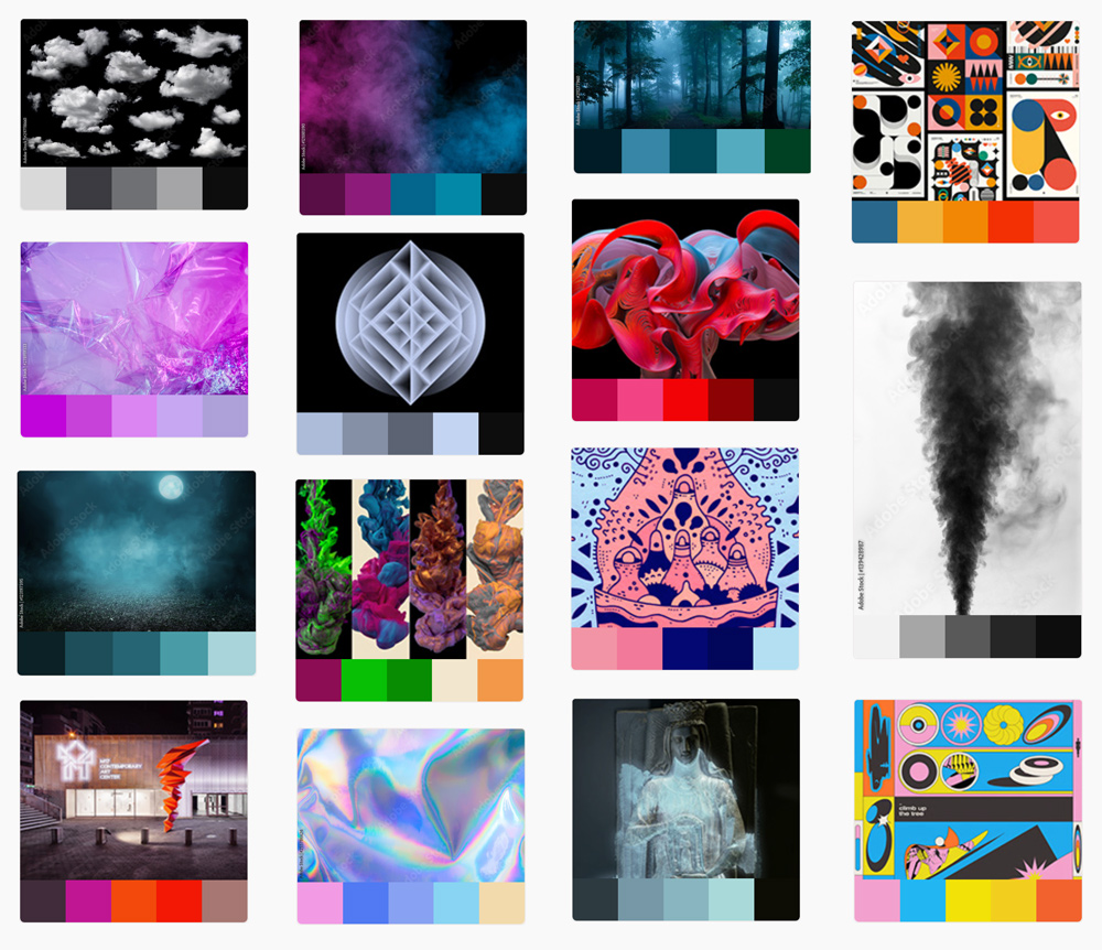
Colour trends in graphic design can be studied on Instagram, Pinterest, Pantone and via leading branding studios’ work. This is our job (and, well, passion) here at Universe. While being aware of trends is crucial, when you go with a trendy colour palette then there is a good chance your brand will appear dated quickly and also that you become white noise in a sea of competing brands all using the same colours.
We prefer to create colour palettes that are contemporary and typically a little left of centre, while always communicating the appropriate tone first and foremost.
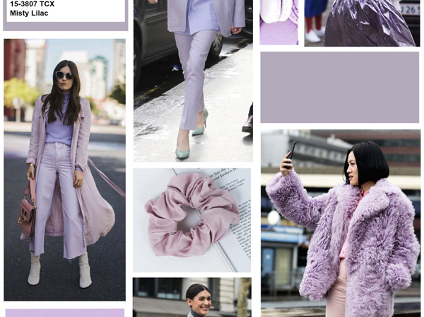
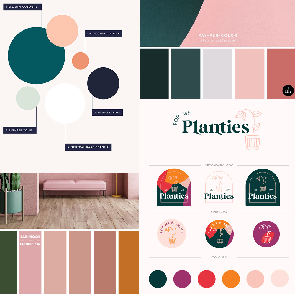
Look familiar? The current trendy colour palette we are seeing everywhere: peach & forest green
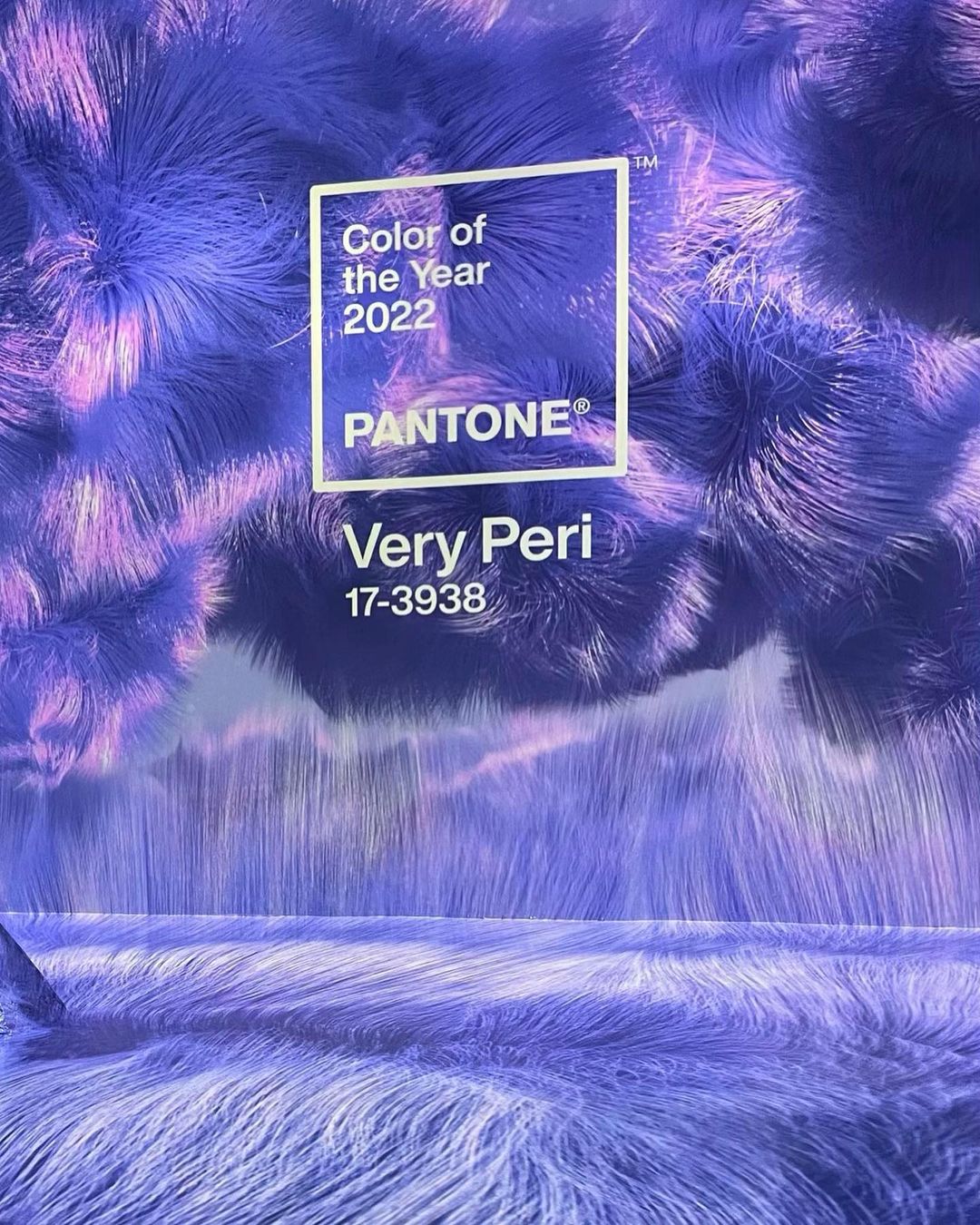
On our radar: Pantone colour trends
Pantone colour trends reports are an essential reference for upcoming colour trends. The Pantone Color Institute™ is a consulting service within Pantone that forecasts global color trends and advises companies on colour in brand identity and product development, for the application and integration of colour as a strategic asset. Recognized around the world as a leading source of colour information through seasonal trend forecasts, custom color development, and palette recommendations for product and corporate identity, Pantone Color Institute partners with global brands to leverage the power, psychology and emotion of color in their design strategy.
Where do we start?
Research
Part of our initial brand design discovery process involves studying your market space and competitors. In some sectors colour palette will have less room for creativity and could even have political sensitivities so we will brainstorm palette ideas for you in our initial stylescape to ensure we are on the right path right from the beginning.
Inspiration
Inspiration can come from anywhere. Maybe you have a favourite sweater, photograph, or car colour that you love and we can start from there with creating an interesting, contemporary, usable palette that incorporates it.
Related work
Nothing found.